A great logo puts makes your brand recognisable. A poor one does too – for all the wrong reasons.
Your logo has to make your customers think the best of you. Learn from the worst by seeing what a poorly designed logo looks like.
Then make sure you make none of the same mistakes…

Credit: AdWeek
Sports has been responsible for some of the worst logos ever. Teams, events, and organisations have all been guilty. Since 1920, the Olympic Games has had both great and awful logos. The 2012 London Games had a real no-go logo. The inspiration came from energy grids. The idea was to have a “prescribed anarchy,” one that was edgy, artistic, and timeless. The reality was a mess. One that looked more like a swastika than a symbol of the multicultural Olympic Games.

Credit: Logogala
This lovely logo is the opposite to the London 2012 logo – steady, rather than busy. Gentle, instead of energetic. Clean, not chaotic. While it gives nothing away about the company, it makes you warm to it instantly.

Credit: Multichannel
The telecommunications industry has some rotten logos – like UK company BT. It also has some stylish ones – like US brand AT&T. Verizon is in the the former camp. It’s check symbol looks like a tick on a school assignment. The result is the logo ruined by a meaningless visual.
The idea is that the tick makes you think of electricity and connectivity. But including it makes the logo look incomplete. A better idea would be for Verizon to go with the name – let the reputation speak for itself.

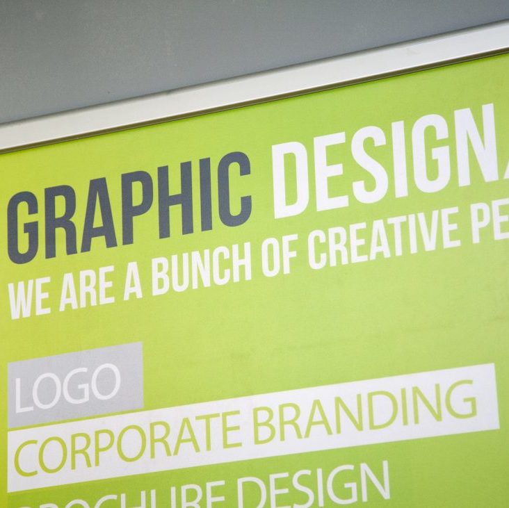
Credit:Limelight Design & Print
If you’re going to add imagery to your logo then make sure it’s relevant. UK brand Limelight Design & Print includes a “D” alongside the company name. It’s easy on the eye and the message is clear: “D means design. See a D and think Limelight Design & Print.” It doesn’t try too hard and that’s why it succeeds.

Credit: Reebok
If Limelight Design & Print’s design was able to make an association, Rebook’s is the opposite. For generations, Reebook’s been known for its unique logo. It was less recognisable than Nike, but still one you’d know instantly as Reebook. Then the company rebranded.
The logo now features a completely generic image. Throw it in among Adidas, Kappa, Puma, and the rest of the sports brands. What’s the result? It’s the one logo people won’t pin to a brand.

Credit: Moosend
Make your logo recognisable to your brand, not forgettable. Moosend understand this. The company sells email marketing software. It’s also named after a cow. Result? A logo with a cow holding an email. It’s easy to remember and won’t be forgotten in a lineup. Bravo.

Credit: legalinsurrection.com
It’s pretty clear what Hillary Clinton was going for here. Her campaign logo includes the initial for first name. Part of the initial has an arrow pointing. The message is clear. Hillary Clinton is about change. She’s about moving forwards. This is the President of the future. This is someone for you to take to heart and believe in. The result rather different.
It’s cold. It’s impersonal. It’s sharp edged. It’s edgeless. It puts things in boxes. The arrow is moving to the right (for a left wing candidate). It’s not a million miles away from the Cuban flag (something Hillary definitely wouldn’t want). Instead of making an emotional connection, you’re turned off by the lack of emotion. It makes your skin crawl. This logo is everything Hillary wouldn’t have wanted.

Credit: Morton Salt
I end with one of my favourite logos. It’s a masterpiece. It’s no surprise the salt girl has been part of Morton Salt’s logo for over a century. It’ll be a shock if it isn’t the company’s logo for another century.
The logo pulls the trick of being both timeless and of this time. It does that because it uses real emotional triggers – the battle against the elements. The rain and the wind make a real chill run down your spine. The salt dries you out. Getting inside your skin is what every logo aims for. Morton Salt is one of the few companies which achieves this.
Your logo becomes what you’re known as. The best ones cross continents and break language barriers. They leave a lasting impression, a positive one. The worst logos fail to hit the mark, get the wrong reaction, or are forgettable.
Check your logo. If it makes any of the mistakes you’ve seen in this article then think about a rebrand. If it doesn’t then ask yourself: “is it as good as Morton Salt’s?”
Contact Limelight Design & Print today to discuss your logo options.
Kayleigh Alexandra is a content writer for Micro Startups – Follow us on Twitter @getmicrostarted.
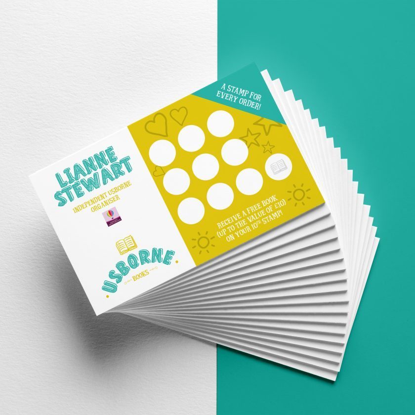
Our high quality print can be in your finger tips within 3 days. Specialising in business printing.
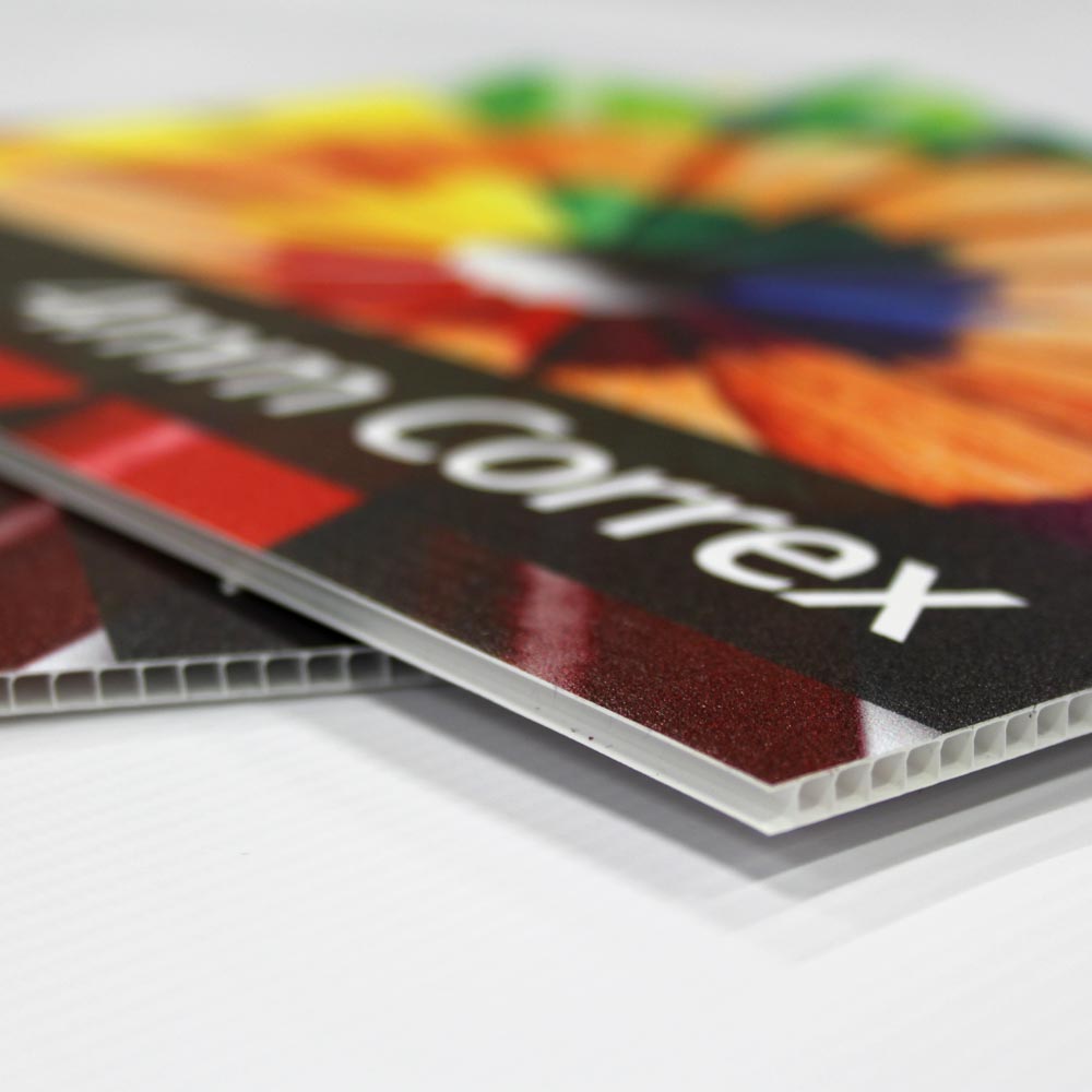
Experts in sign printing from correx, foamex and shop facias to banners and window graphics.
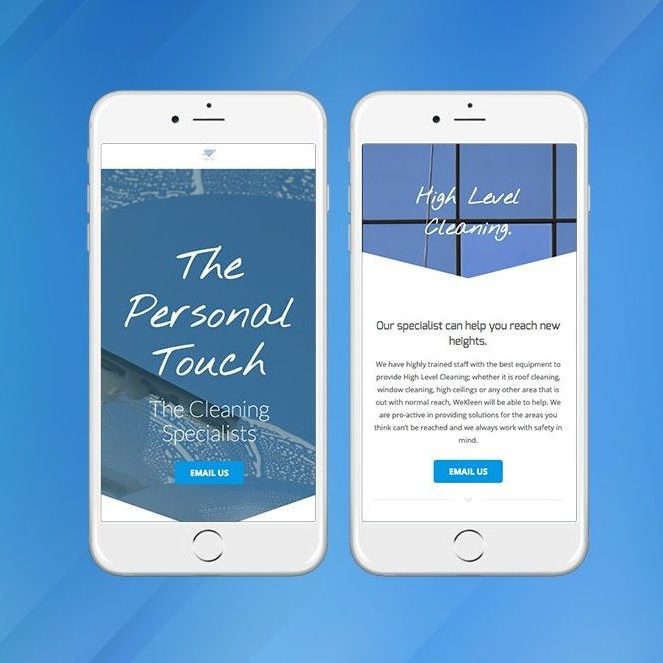
Our website design team will work with you on your website, from initial ideas to final live site.
Our full service design team can create transform your concept to completion