
When a visitor comes to your website they need to be able to find what they are looking for quickly. If links are in the wrong place or don’t work, or if buttons are not visible or placed in the wrong spot, it will make it much harder and the visitor will probably give up and go to one of your competitors. Your website needs to be organised logically in a simple way. You want each page to have a similar lay out with headers, footers and navigation bars in the same places. This means they can glide around your site in as few clicks as possible.
The homepage is what gives the visitor a first impression and you want it to make them stay on your site and then do business with you. The homepage is the perfect opportunity to show them what you are all about but while doing this you can over do it. You want to keep the page clear to read and organised. To do this don’t have too much text and if you want to use more than one image have them as a sliding gallery!
If you want the people who visit your website to call/register/subscribe/buy etc. then you need a ‘Call to Action’. This means getting them to act. The majority of the time these are shown as buttons and links. If the visitor has read all about your product for example you then need to encourage them to do something, which is actually buying it!
Having Out of Date content on your website will deter customers from contacting you. Visitors will want to know that they will get a response quickly. It is really important to make sure your contact details are correct and up to date! Updating your website often is really important to your ranking on search engines.
Our high quality print can be in your finger tips within 3 days. Specialising in business printing.
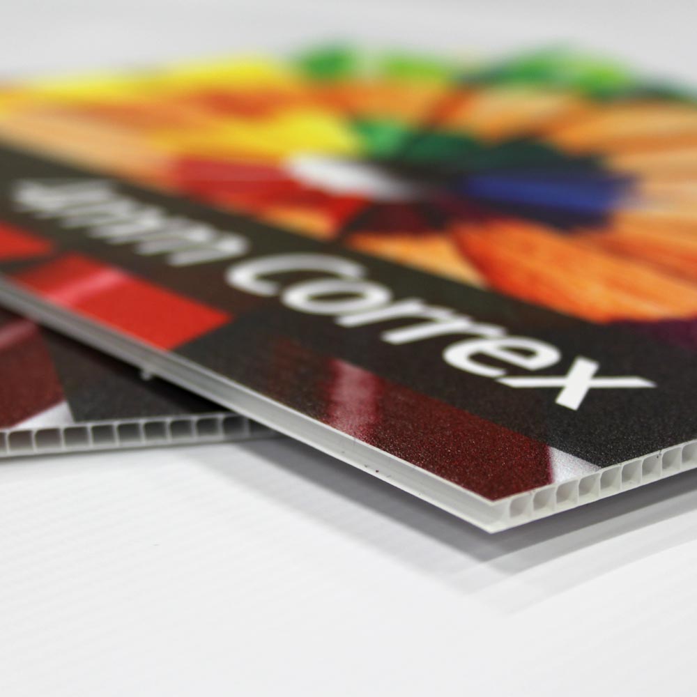
Experts in sign printing from correx, foamex and shop facias to banners and window graphics.
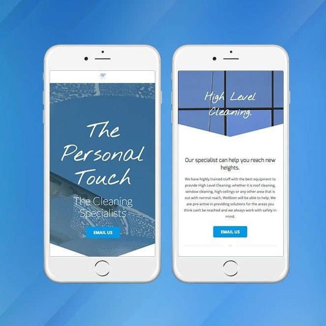
Our website design team will work with you on your website, from initial ideas to final live site.
Our full service design team can create transform your concept to completion